About Me
Portfolio
Payment Receipt
Post-payment handling
One of my earlier design initiatives at BitPay was creating a "receipt" UI pattern that would help us globally show payment details in the Invoice, Dashboard, and emails. This pattern was heavily inspired by Cash App's receipt patterns. While initially very similar in my email designs, I slowly differentiated while adapting the system for Invoice.
The result is an elegant representation of your blockchain payment. Cryptocurrency is the closest thing to electronic cash so I wanted this pattern to invoke the real-world counterpart.
Fully Paid
The last state in a successful payment
As you can see here, the Invoice price takes the center stage as a big, bold number in the middle of the card. The BitPay Timestamp bar acts as minor mutation of the Details bar to keep a consistent look.
Additionally, the light toast under the card acts as a non-intrusive way to prompt the user for an optional action. The process of designing the Success state was definitely the easiest; the green color is quick way to signify a positive state while the payment details are fixed top level.
Previously, the Success state was just a small card with the details buried a level down in the Info icon.
V4 Reference Implementation

V3 (Old Design)
Merchant Initiated Refund
Intuitive refunds for ecommerce
One of the primary actions when receiving a crypto refund is cross-checking the amount you spent against the current exchange rate. Elevating payment details to the top level really makes the Refund flow more usable.
You can already see that the "Post-Payment" part of Invoice is meant to be minor mutations of the receipt UI pattern. By modifying small details like the icon, color, and heading, we can create a consistent experience that feels familiar no matter what point you visit the Invoice.
Here you can another usage of the Black Toast, this time serving as a primary action with content. The Toast pattern for Refunds was carefully chosen; because a user will typically cross-check their initial payment, we want to constantly keep that as the primary content. The refund process itself can take a backseat while still being highly accessible.
V4 Reference Implementation
Underpaid
Payment failure handling
The main idea I brought to the Underpaid state here is immediately signaling payment failure. With the launch of P2P, I knew payment errors would be something we would deal with more often. The V3 configuration of this state provides lots of information but does not clearly communicate the status.
The benefit to the receipt UI pattern is that it allows a user to easily see their own mistake. In this case, the user paid about $200 less than they needed to. Underpayments can happen for all sorts of reasons but the most common is that some wallets and exchanges subtract the transaction fee from the amount you enter resulting in a less than intended amount of funds arriving on our end.
V4 Reference Implementation
V3 (Old Design)
Overpaid
Payment change handling
Because an Overpaid state is still a successful payment, I wanted the new state to reduce alarm as much as possible while still prompting the user for an address. The result is a duplication of the normal Refund state. With the details exposed, the user can easily see their mistake.
V4 Reference Implementation
V3 (Old Design)
Slow Payment
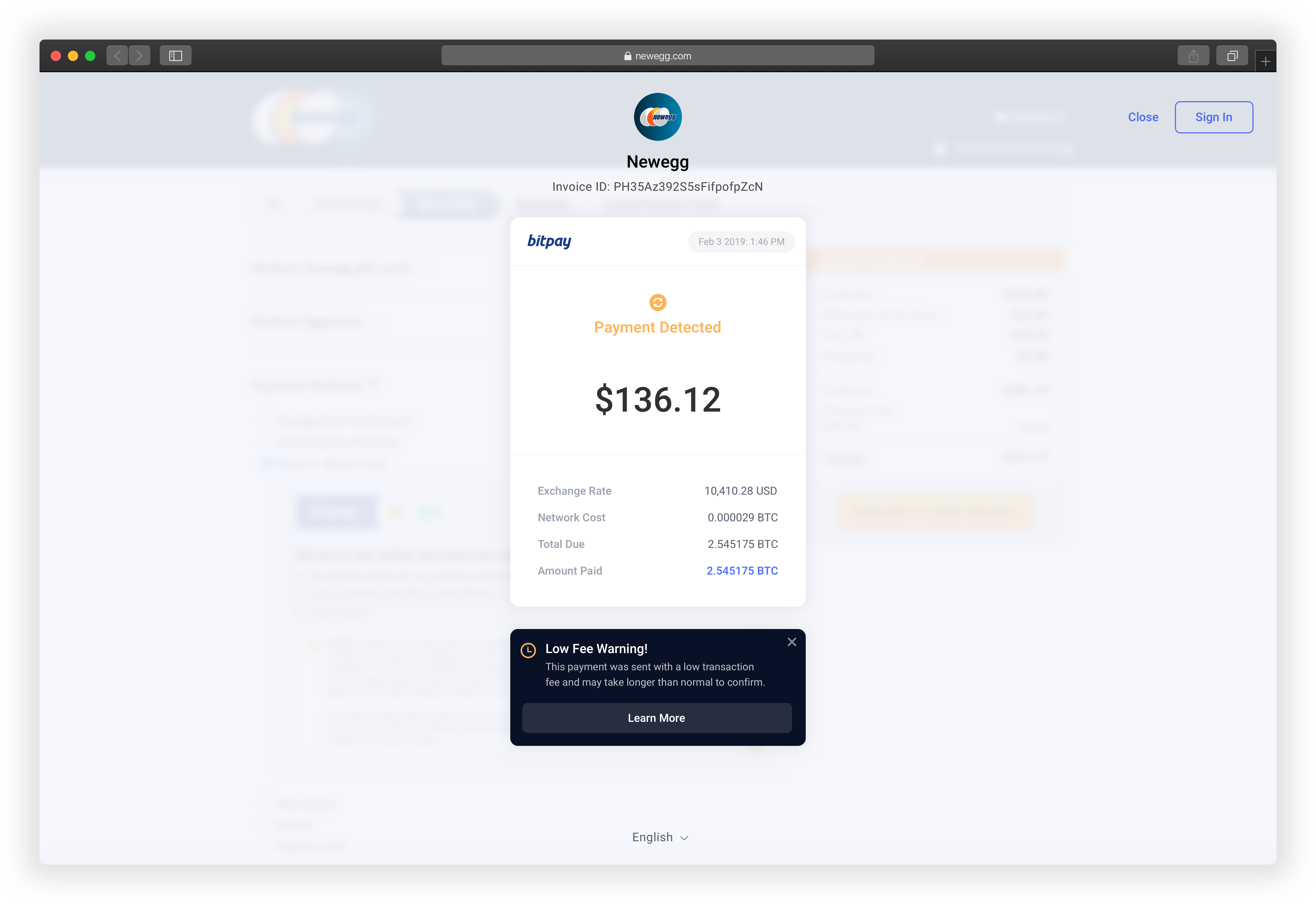
Low miner fee handling

Lastly, for the Low Fee payment state, I wanted to reduce the heavy language while still providing some info to the user of the situation. Again, a simple mutation of the header, color, and icon is all that is needed to prompt a "Caution" state. Low fee payments can sometimes end up failing when the miner fee network spikes. With RBF, BTC users can bump the fee to speed it up if they hit this state.