About Me
Portfolio
Log In & Sign Up Breakdown
Modular, single-purpose states
In early 2019, I was wrapping up the Directory project and BitPay ID was just about to begin development work. The circumstances of this project left us on a extremely tight time frame to finalize requirements, create designs, and then build it all out.
This project was also unique in its strategy for rollout. Instead of building out a full consumer dashboard experience, we opted to start small and only build the Authentication and Verification portion that could be dropped into our payment gateway (Invoice). This would allow us to meet our risk management for high value invoices while maintaining a minimally complex new system.
So the scenario boiled down to this. I needed:
- 1Super fast turnaround (1 week)
- 2Style consistency with Invoice
- 3Style consistency with an unknown Consumer Dashboard
Luckily, working on designing Emails, the new Website, and the Directory all allowed me to have a better grasp on what direction our brand was heading. Ultimately, I chose to go down a neutral, minimal path that would allow us to shape the visual identity of the product over time while also being simple at a component level.
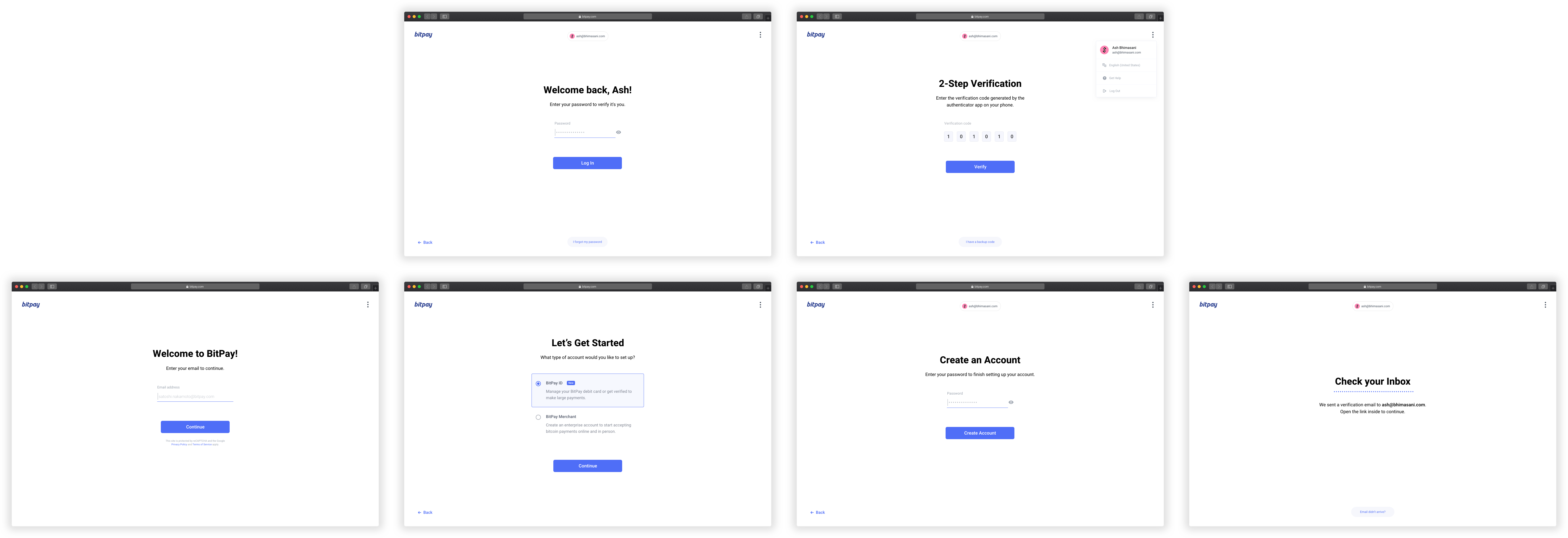
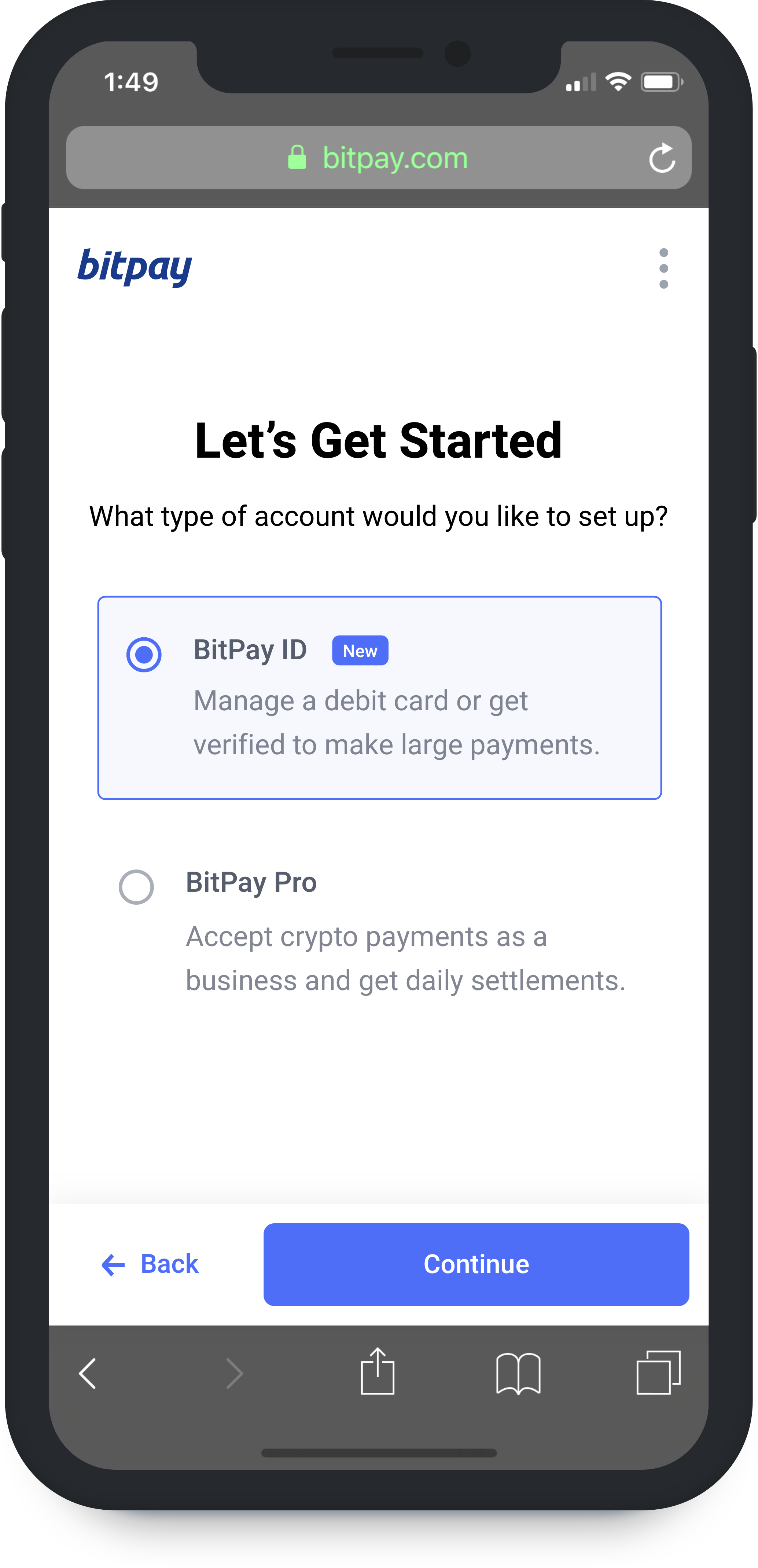
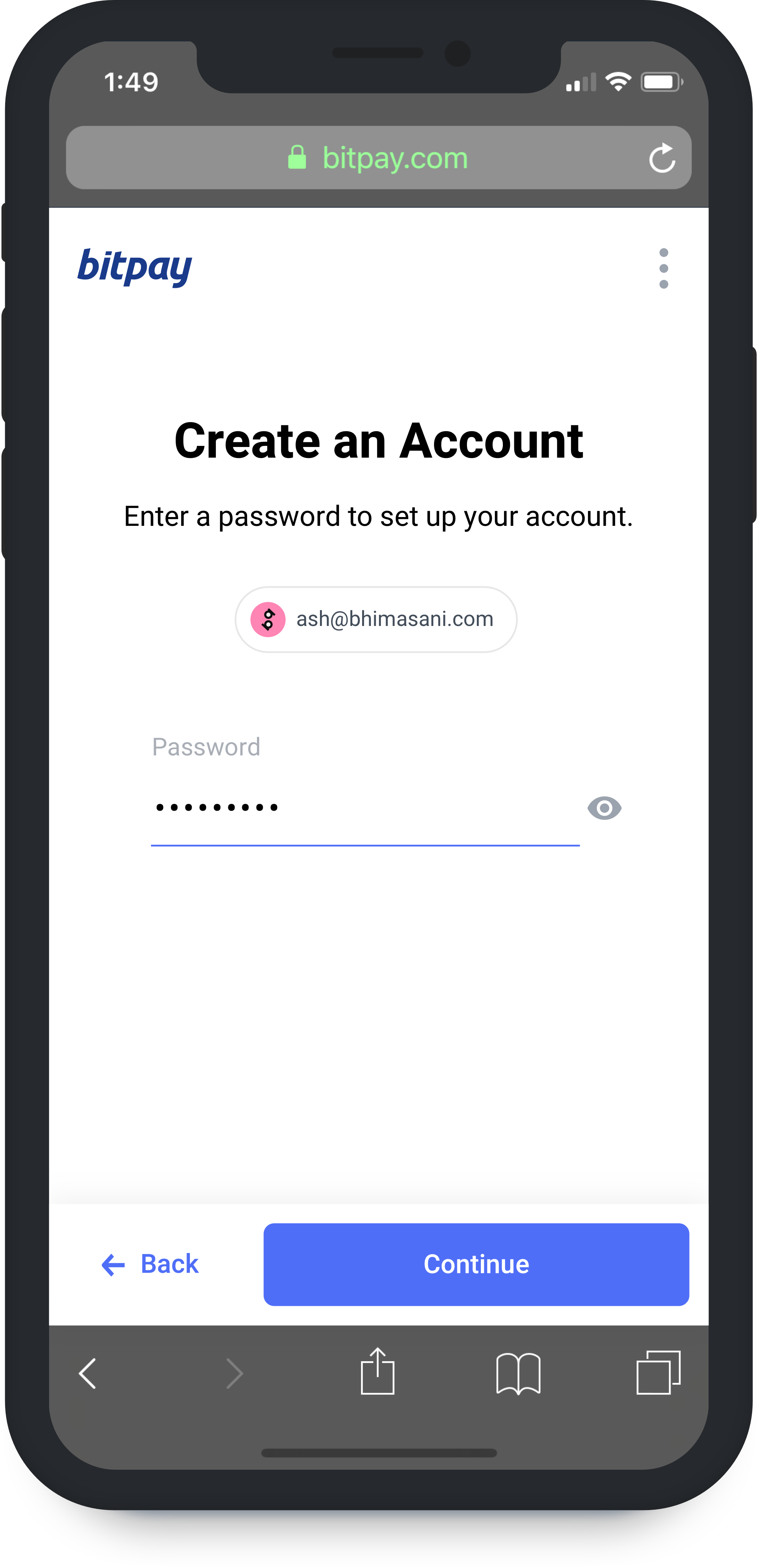
Create an Account
A minimal, walkthrough-like experience
Obviously, the first part of any Authentication flow is the Account Creation flow. This would be utilized whenever a user visits our payment gateway when making a transaction over $3k USD.
Initially, we had the idea of splitting the Email and Password fields into their own state; this was so we could strongly tailor someone's experience based on what we know from their email. If had no record of the email entered, then we prompted the user to Create an Account.
As you can see, we also require all new user go through mandatory Email Verification. Verifying a user's email, while typically annoying when trying a new service, is an essential part of keeping the platform secure. When we issue refunds, we have to know that the user's email is valid so we don't accidentally send money to the wrong person (this is crypto after all).
Mobile

From the start of the design process, I knew that the majority usage of this application would eventually be on mobile. After all, our debit card program was the BitPay's first implementation of consumer KYC and we knew a deeper integration between the mobile wallet and the debit card was coming soon.
The biggest reason for using a large white background with centered content on desktop was that we could easily make it work well on mobile with minimal mutations. Fixing the main action button and the header to the bottom and top respectively was all that was needed for a responsive layout.
For mobile, the single-purpose state layout really worked well because of how much space the keyboard takes up on the screen. In fact, if you look at the most successful mobile onboarding flows (Cash App for example), they all utilize this type of state breakup.
Sign In
Universal login for all products
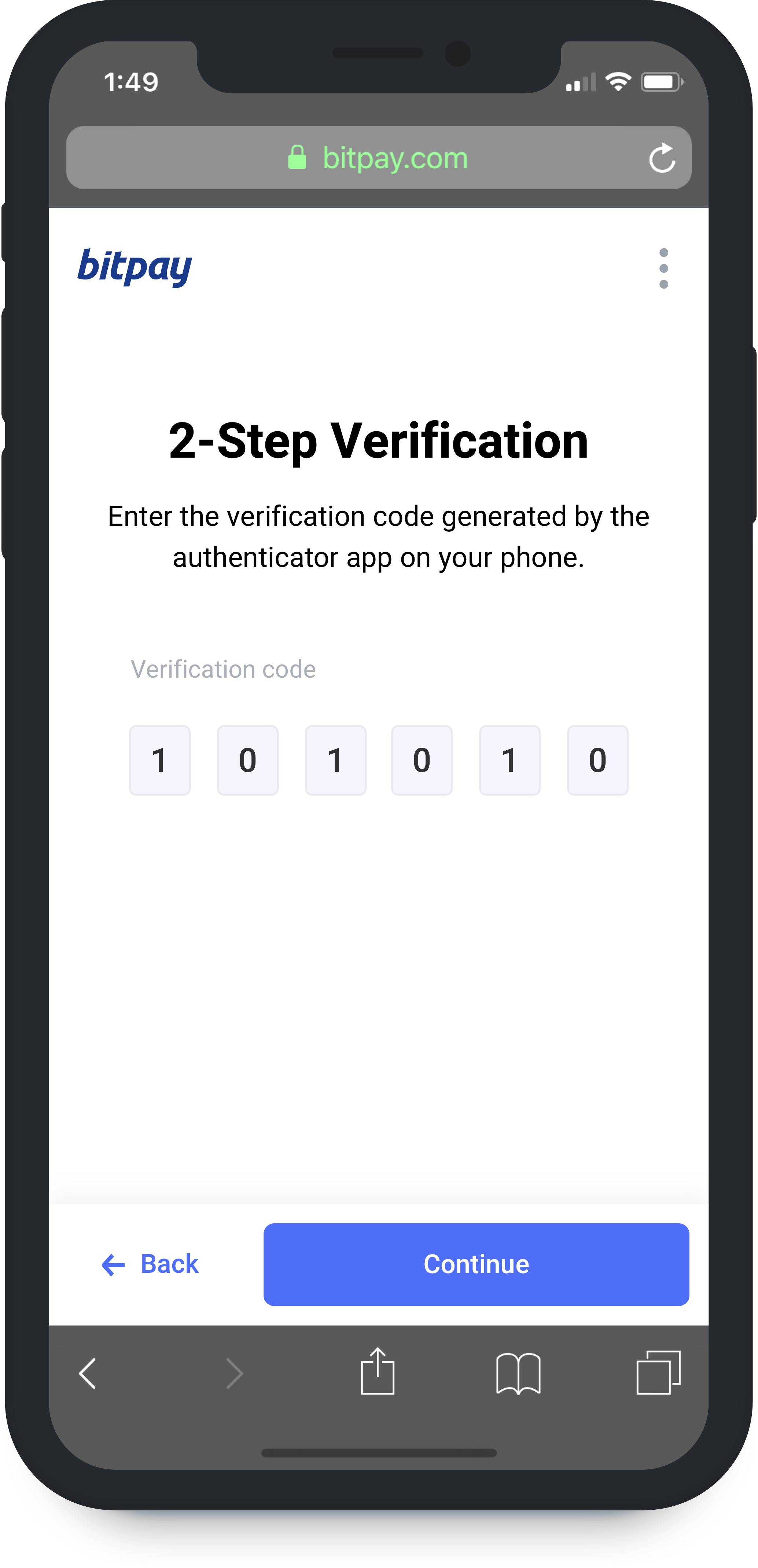
Like I mentioned previously, this was the first time we would be trying a split state for Email and Password fields. The additional complexity here is doing it in way that prevents enumeration attacks without excessively utilizing reCAPTCHA.
The only major downside to this is changing the optimal clicks from 1 to 2. Where 1 click can be achieved when the user has their credentials saved to their device / browser.
Mobile

Signing in to stuff on mobile is always a real annoyance for me so I wanted to make sure we would be compatible with browser detection and password managers, while attempting to make the experience as painless as possible. Eventually, I can imagine a system where all browser authentication is redirected into the BitPay mobile app where you can authenticate with a single tap similar to Google Prompt.