About Me
Portfolio
Verification Breakdown
Platform-wide interface for KYC / AML compliance

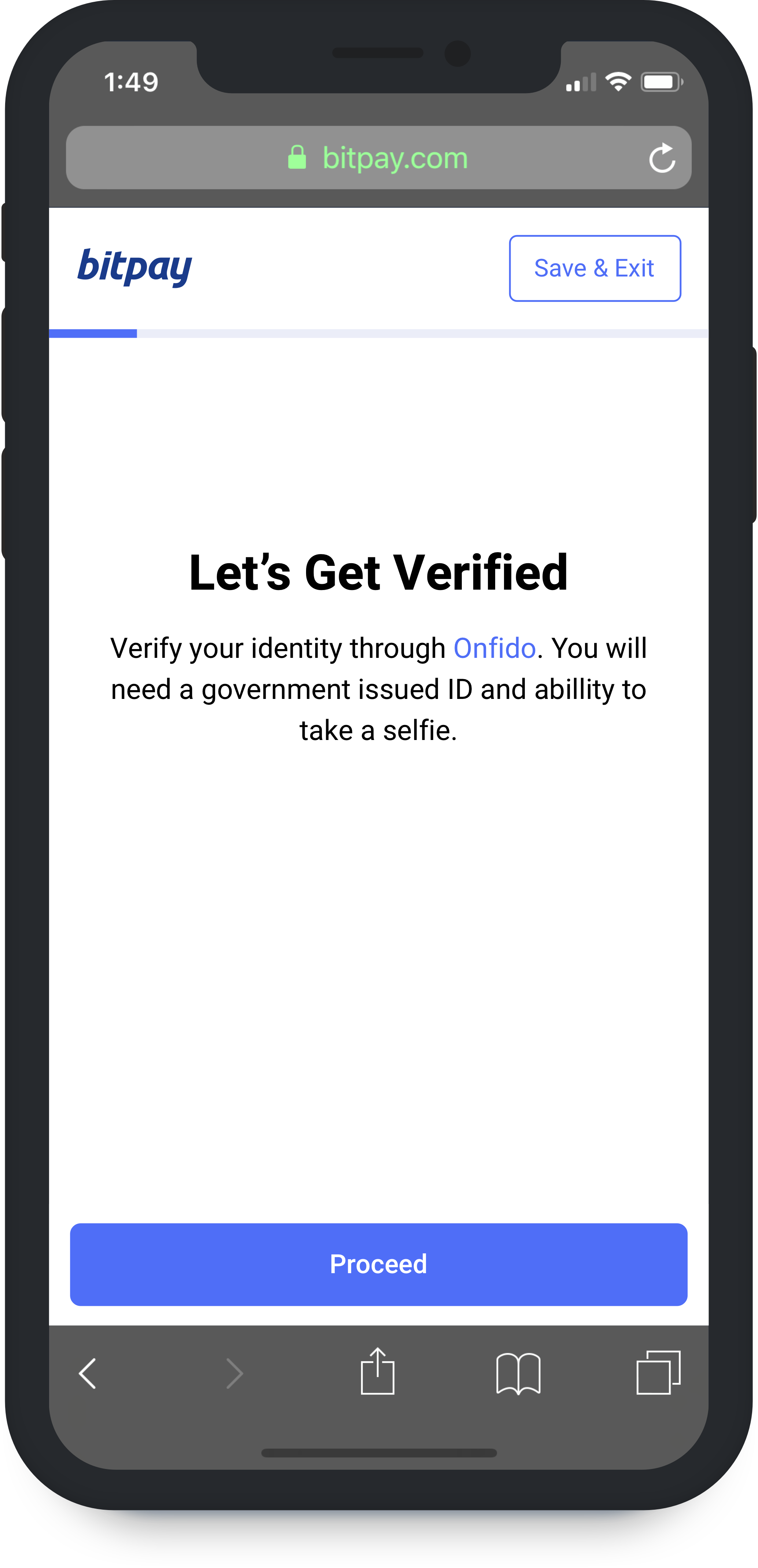
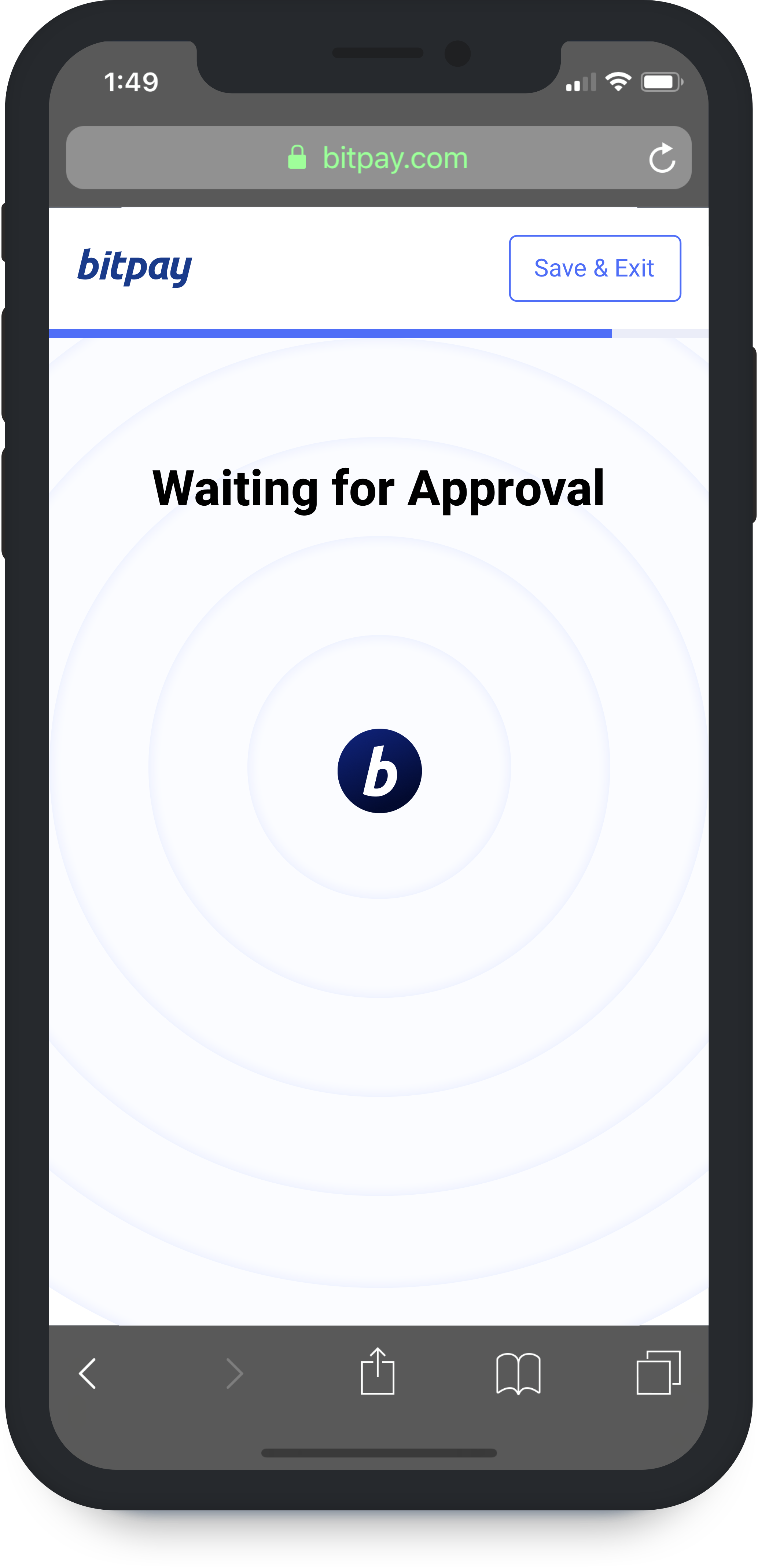
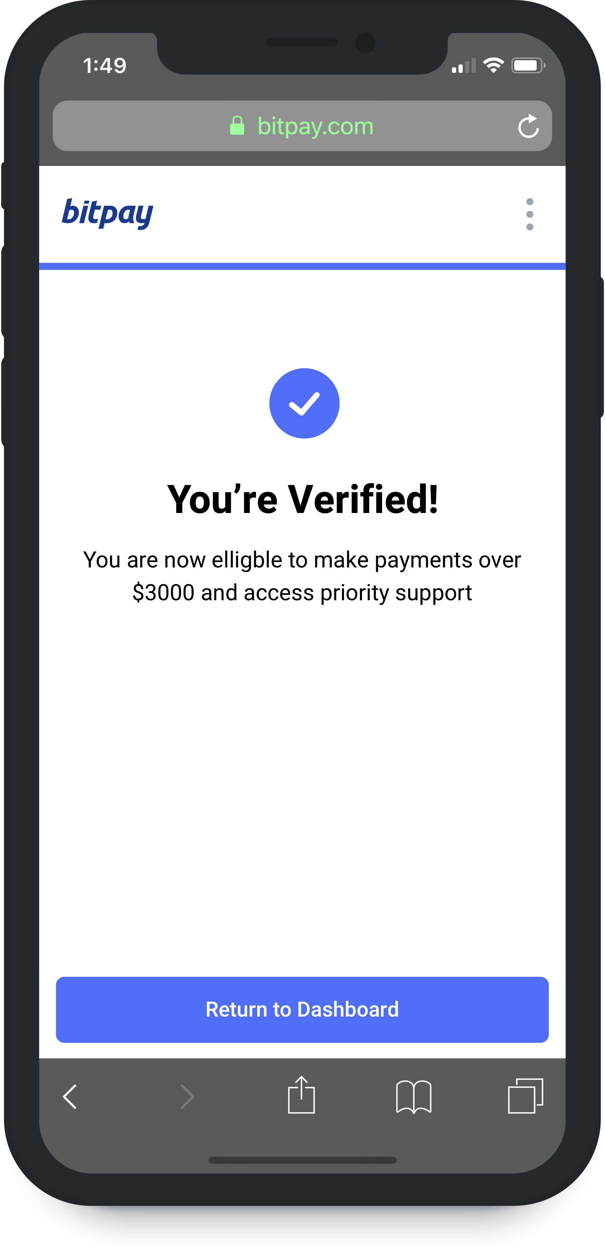
Here is the Verification flow that allows users to receive and make payments over $3000. Verification for high value transactions is a critical step in growing our platform and servicing more users. While KYC is generally a huge friction point; it can still be made convenient.
To create a benchmark, we first looked at Airbnb’s host onboarding. Airbnb focused on allowing users to complete the form in chunks with major parts grouped together and progress saved continuously. When manual input is required, saving state continuously seemed like the most significant upgrade you could give a form.
Onfido ID Upload
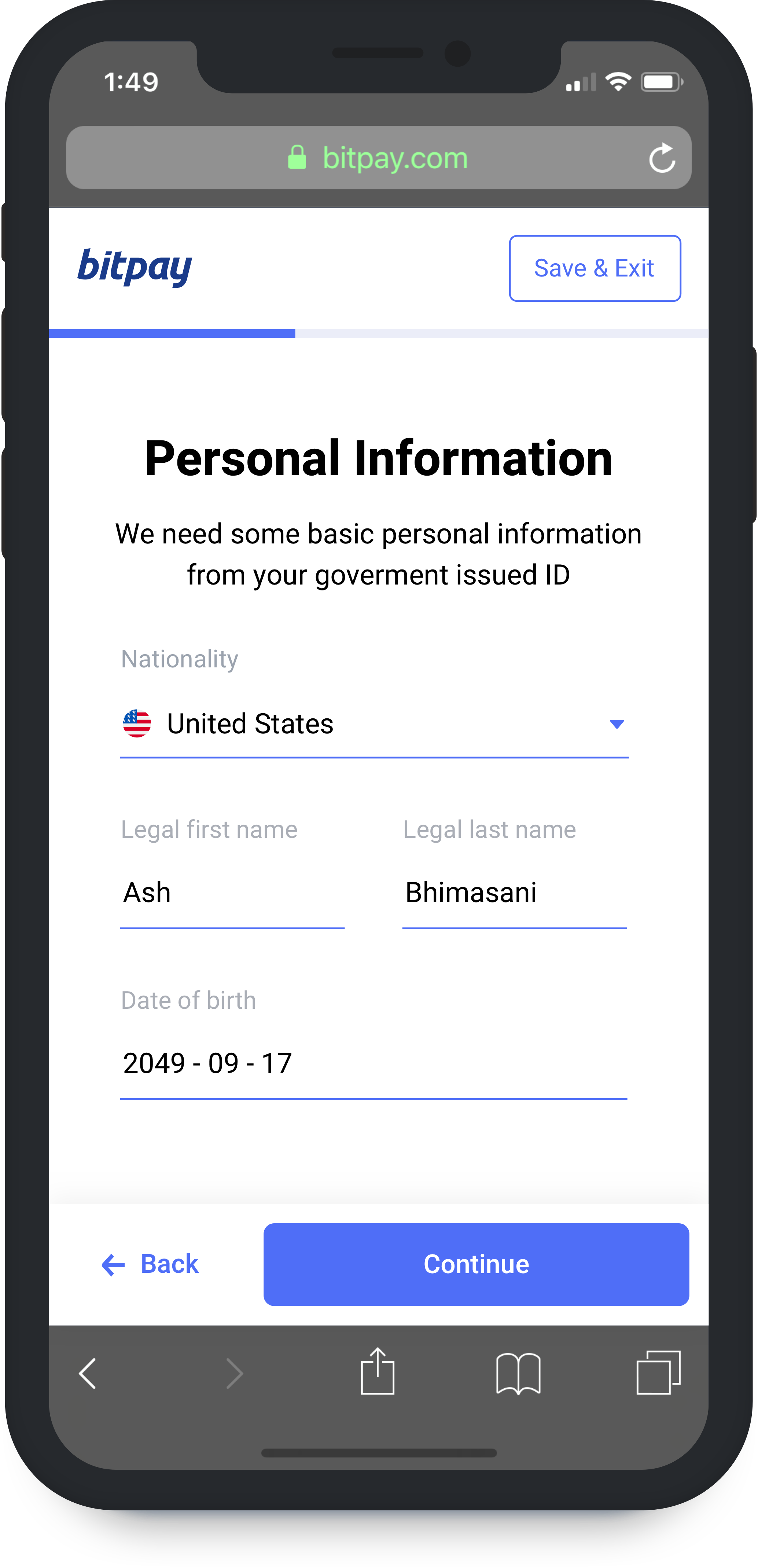
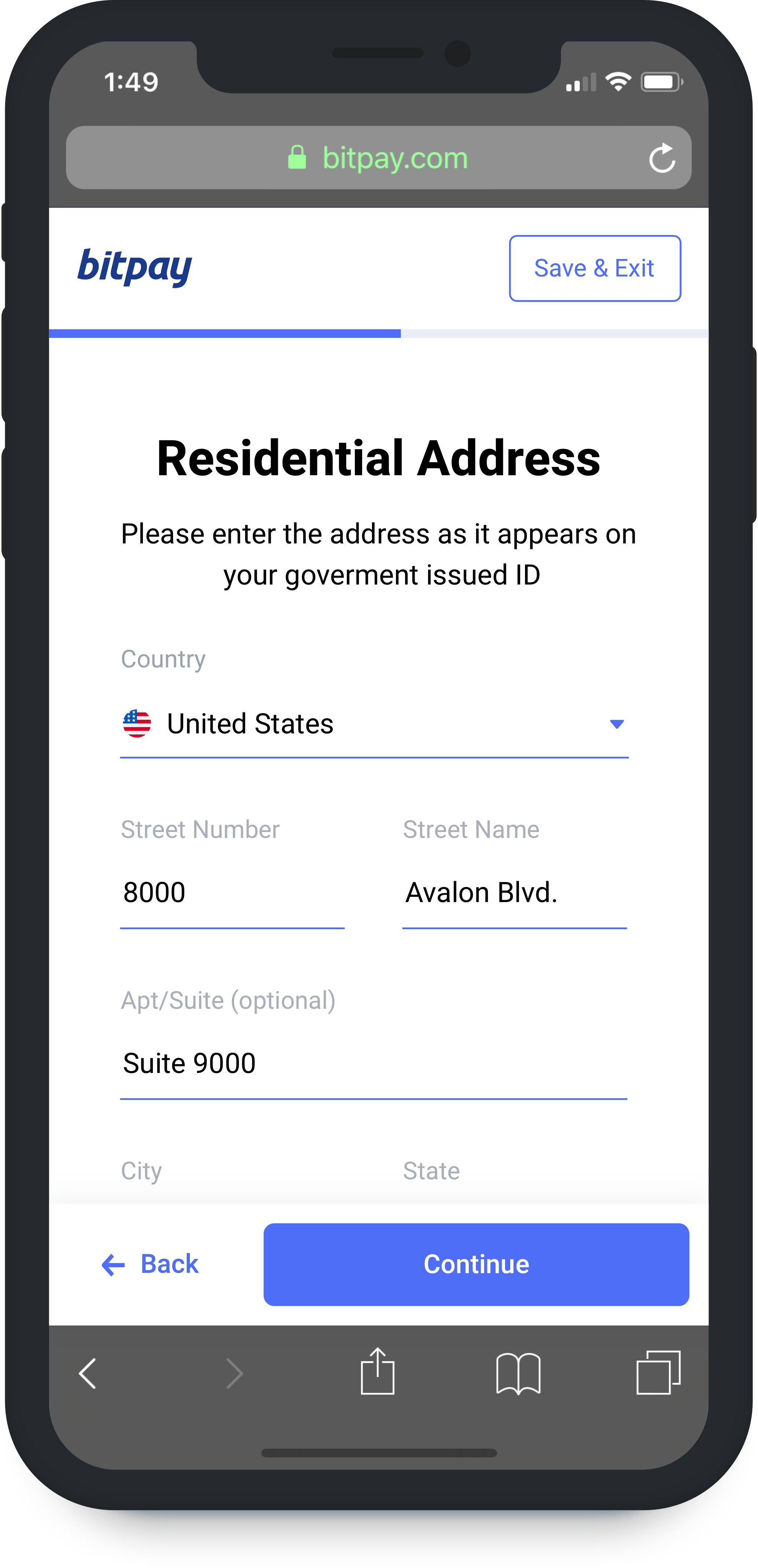
Minimizing error with document parsing
Initially, the design was pieced together assuming that we may need capability for multi-tier flows, with document upload placed after Residential Address. As the project evolved, it became clear that we would only needed to optimize for 1 path.
The brilliant engineers at BitPay quickly reversed the flow, placing document upload first while also adding the functionality needed to extract the strings correctly from Onfido's response. This significantly improved the experience while decreasing the error rate of manual user entry.
The most difficult challenge in this part of the flow was definitely dealing with address formats for a global userbase. While an age old problem, we found ourself constantly tweaking and tuning address formats to meet the specific needs of any one country. Luckily, we have employees from all over the world who helped us catalog these formats and test the flow.
Mobile
Onfido's flow actually works best on mobile because many users don't have a camera on their computer or their phone's camera is much better. The new debit card product highlights this capability to provide a much more native experience within the wallet app using Onfido's iOS and Android SDK.
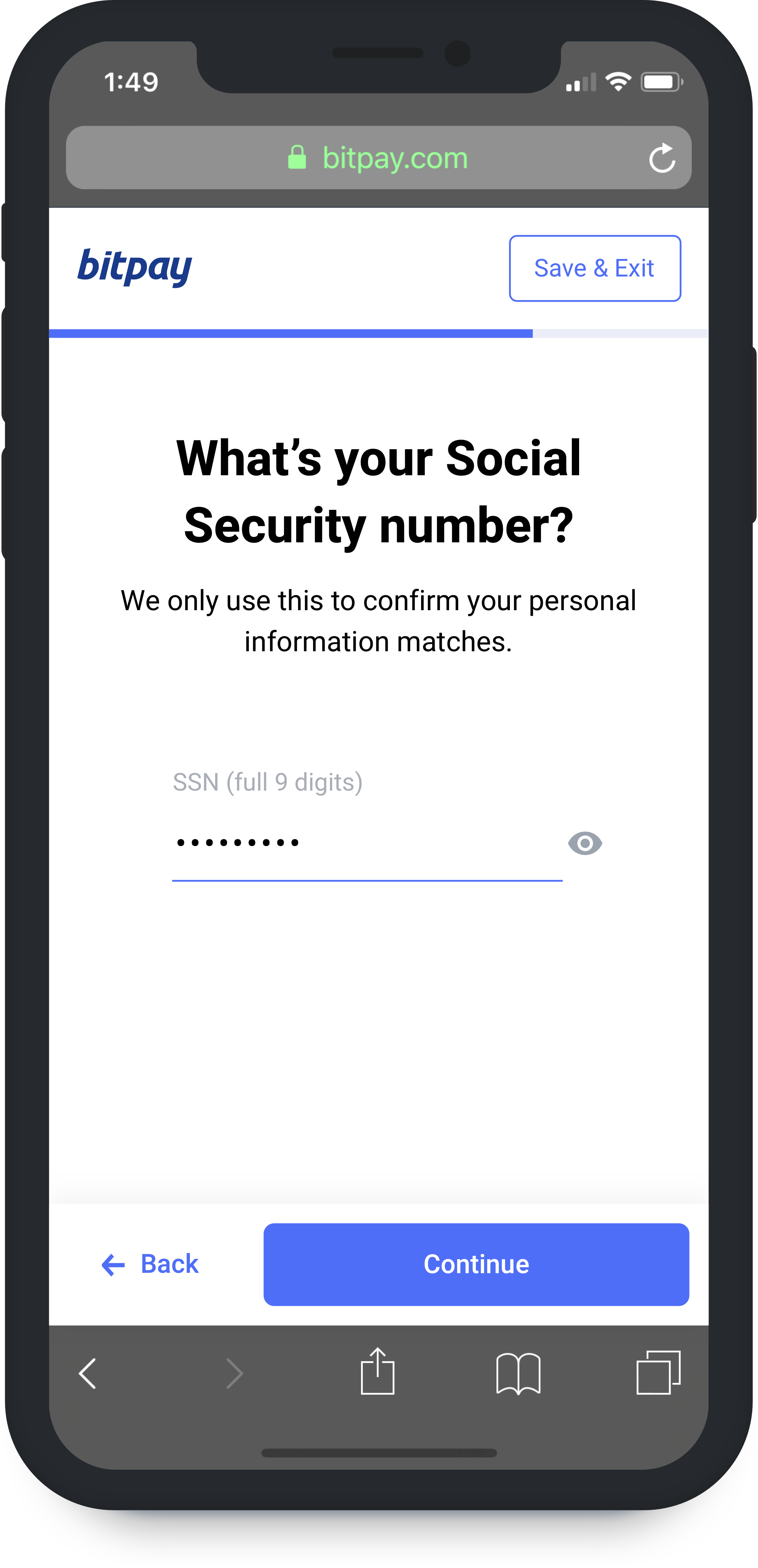
National identification number
Last leg of verification
The final part of full verification is for a user to enter their national identification number. For Americans, this is their social security number; for the rest of the world, we are only required to record their passport number or if they don't have one.
Building UIs around sensitive data entry like this is always tricky; we have to manage both clarity and comfort to make sure we don't spook users. However, in context, we can be less critical. In this case, if you are making a payment over $3k, prompting for this type of information is understandable to the average user.
Mobile
A large takeaway I think for form design and scalable interfaces in general is to assume you will probably need to scroll. As you can see here, we are pinning UI elements to corners and edges of the screen while centering all of our main content.
Additionally, things not being in view when scrolling or typing is an ever present problem that can be minimized by simply adding background and foreground.
After everything was said and done, this project ended up being a huge learning opportunity for me as a designer and engineer. It was my first time really getting into the weeds and working on a highly dynamic project with a plethora of experience problems to solve. Many parts of the design turned out to be a success but I am still looking forward to directly tackling some of the core issues still present with a full upgrade.